How I designed illustrations for a story about improving search

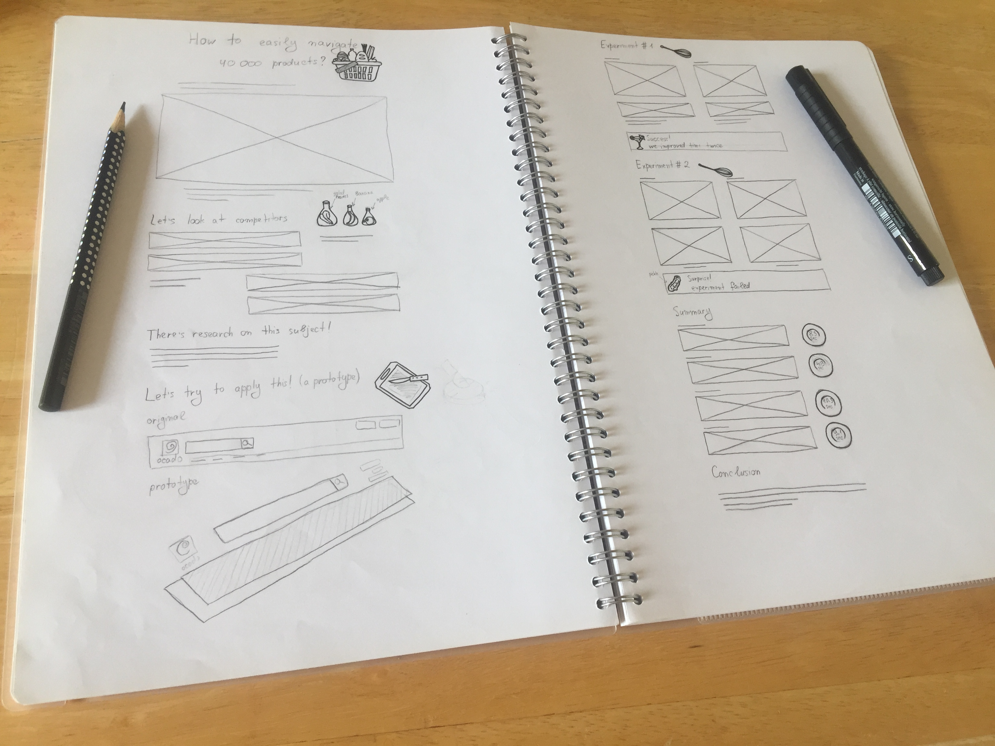
I wanted my project page about search to feel fun and engaging, to convey a positive vibe. That's how I decided to add illustrations to it.

Deciding on a theme

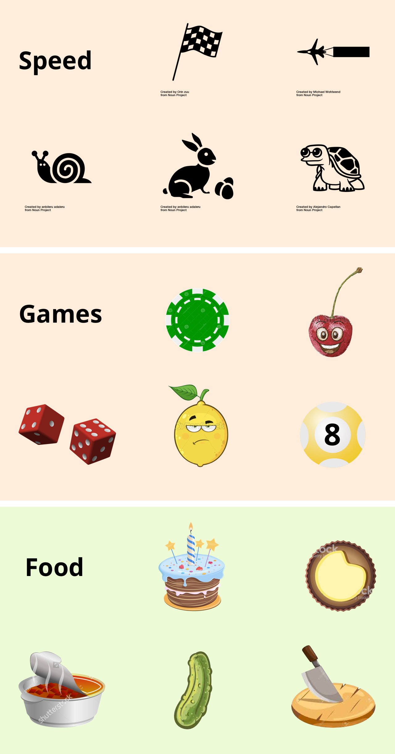
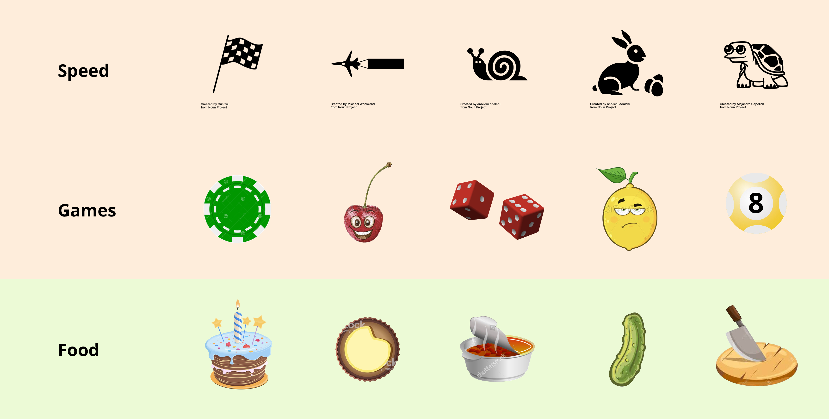
Looking for keywords

Illustrations should have a common theme

Ultimately, the food theme is the closest one to the supermarket and allows for a great deal of creativity. Also, icons illustrating the process of cooking can be very engaging.

Coming up with illustrations within a food theme

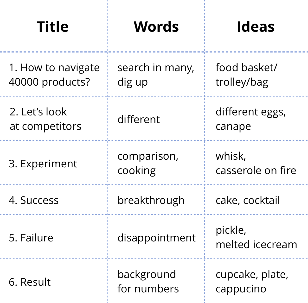
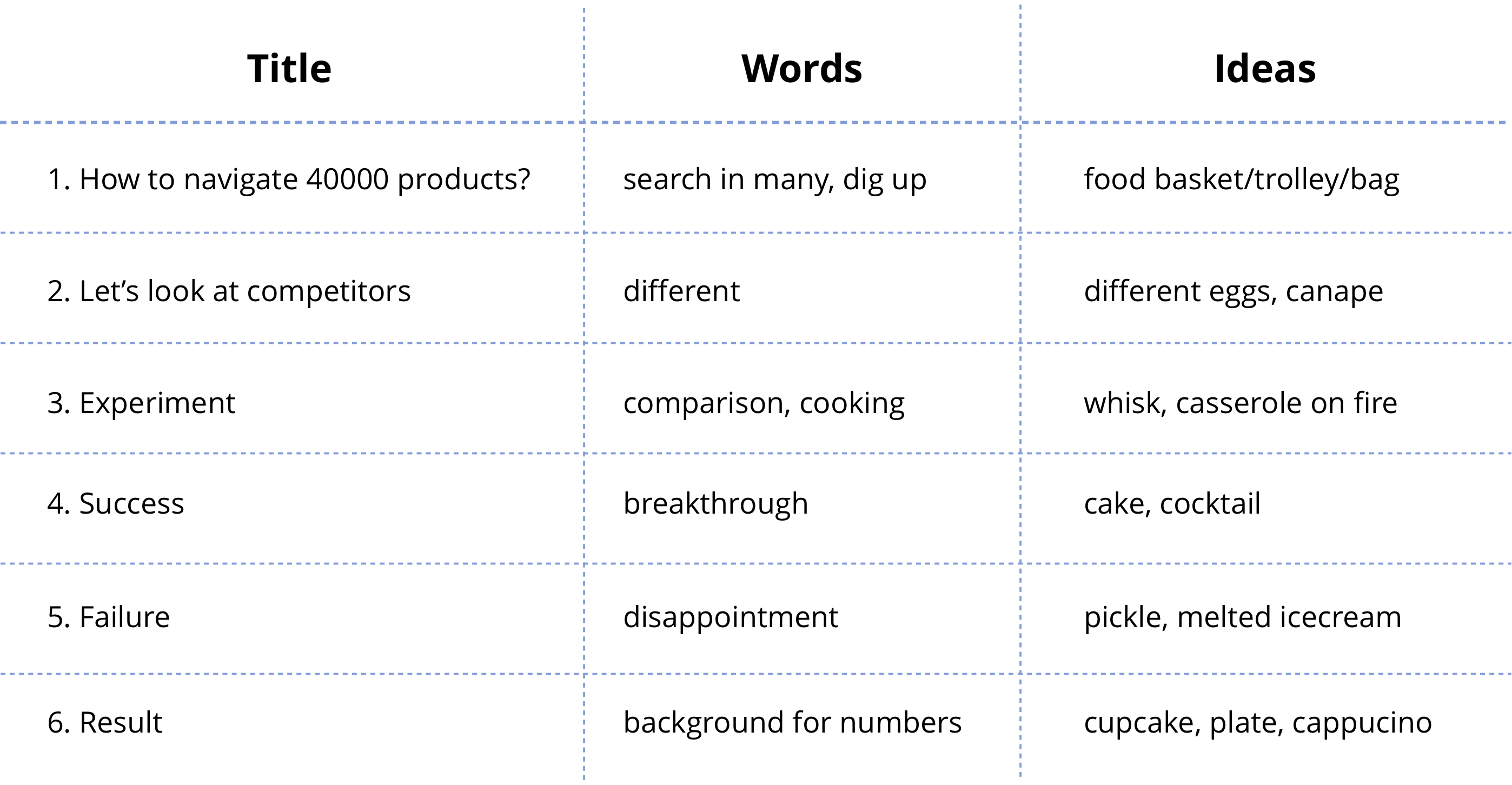
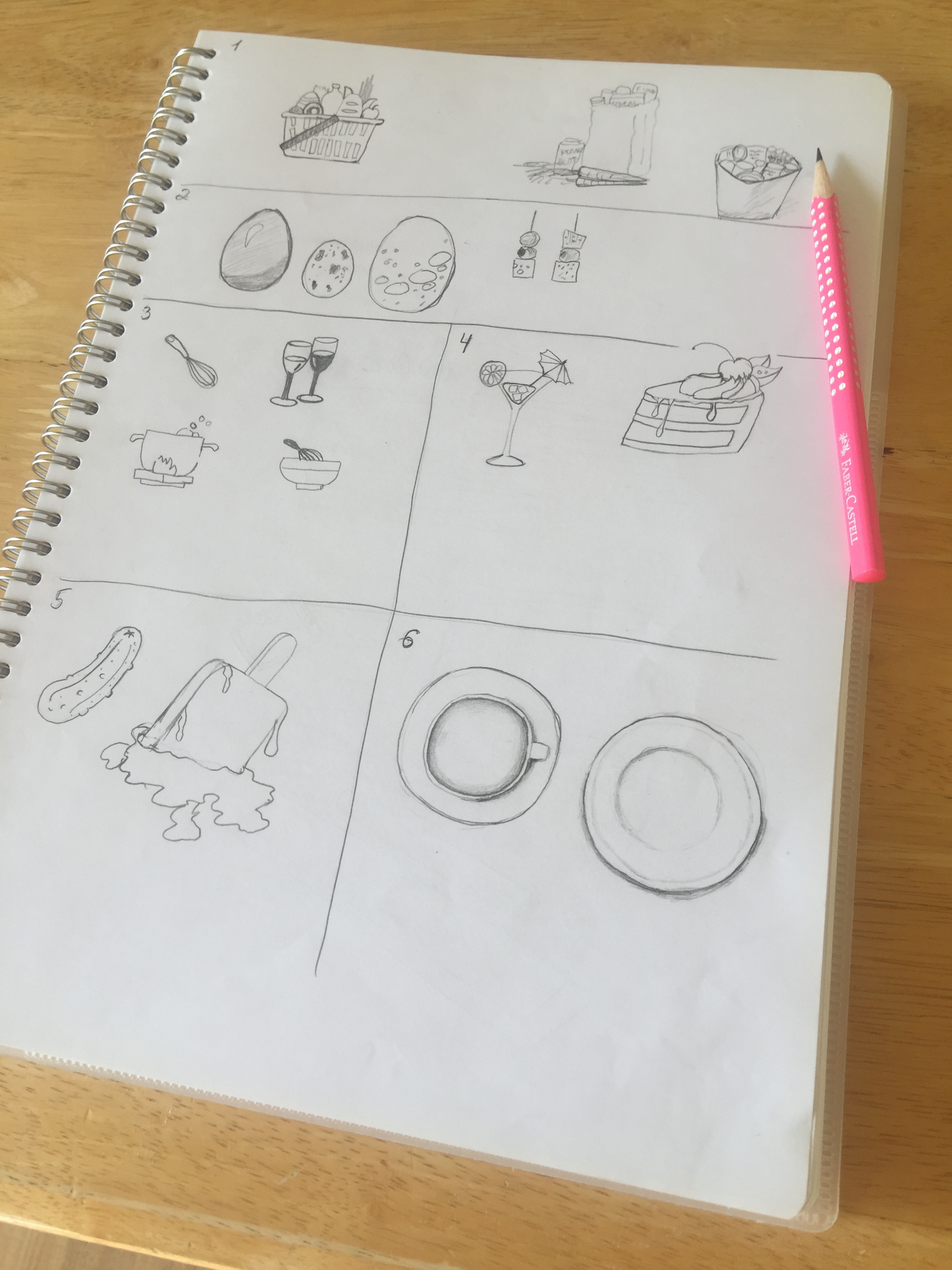
Expanding ideas

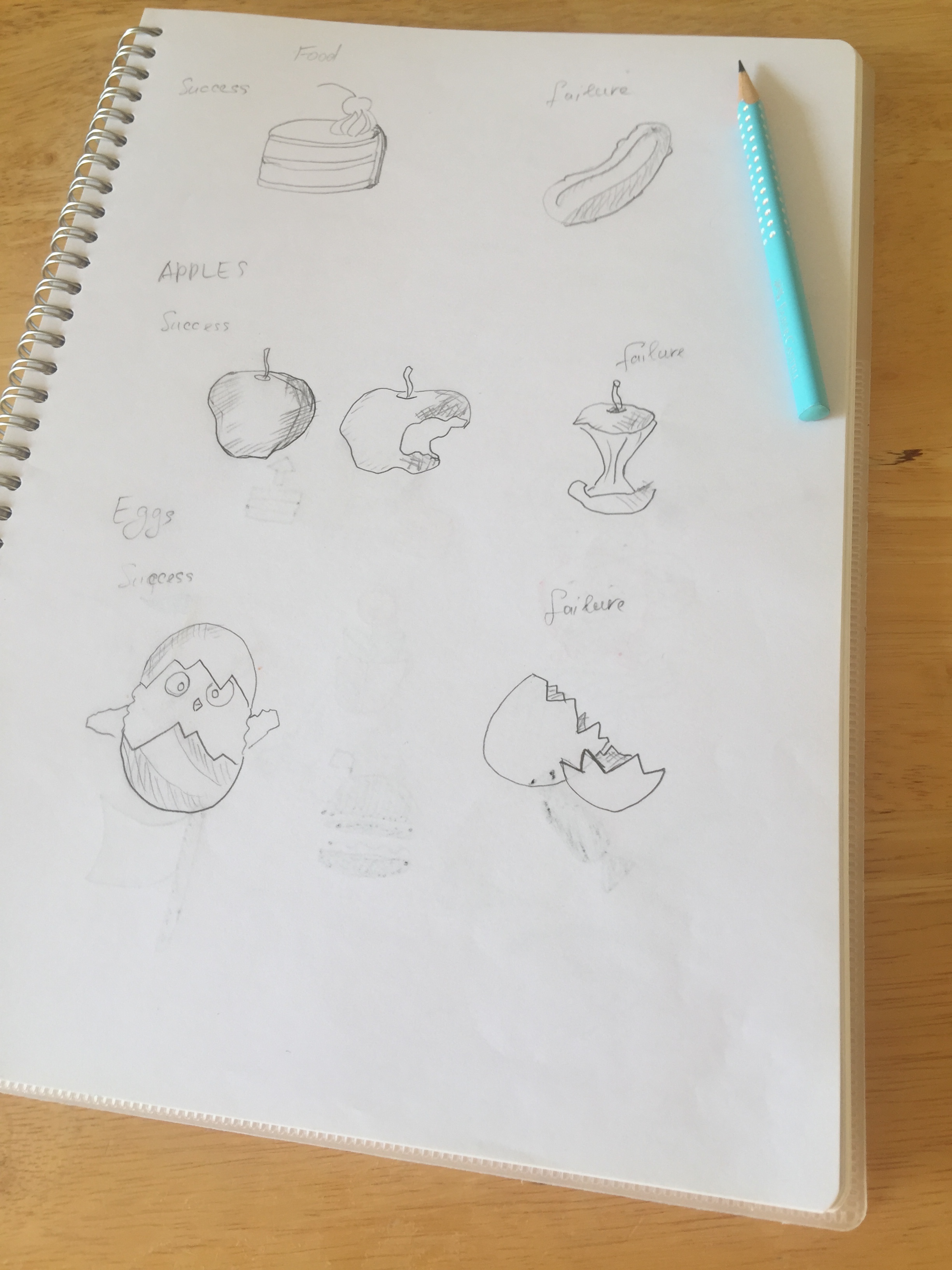
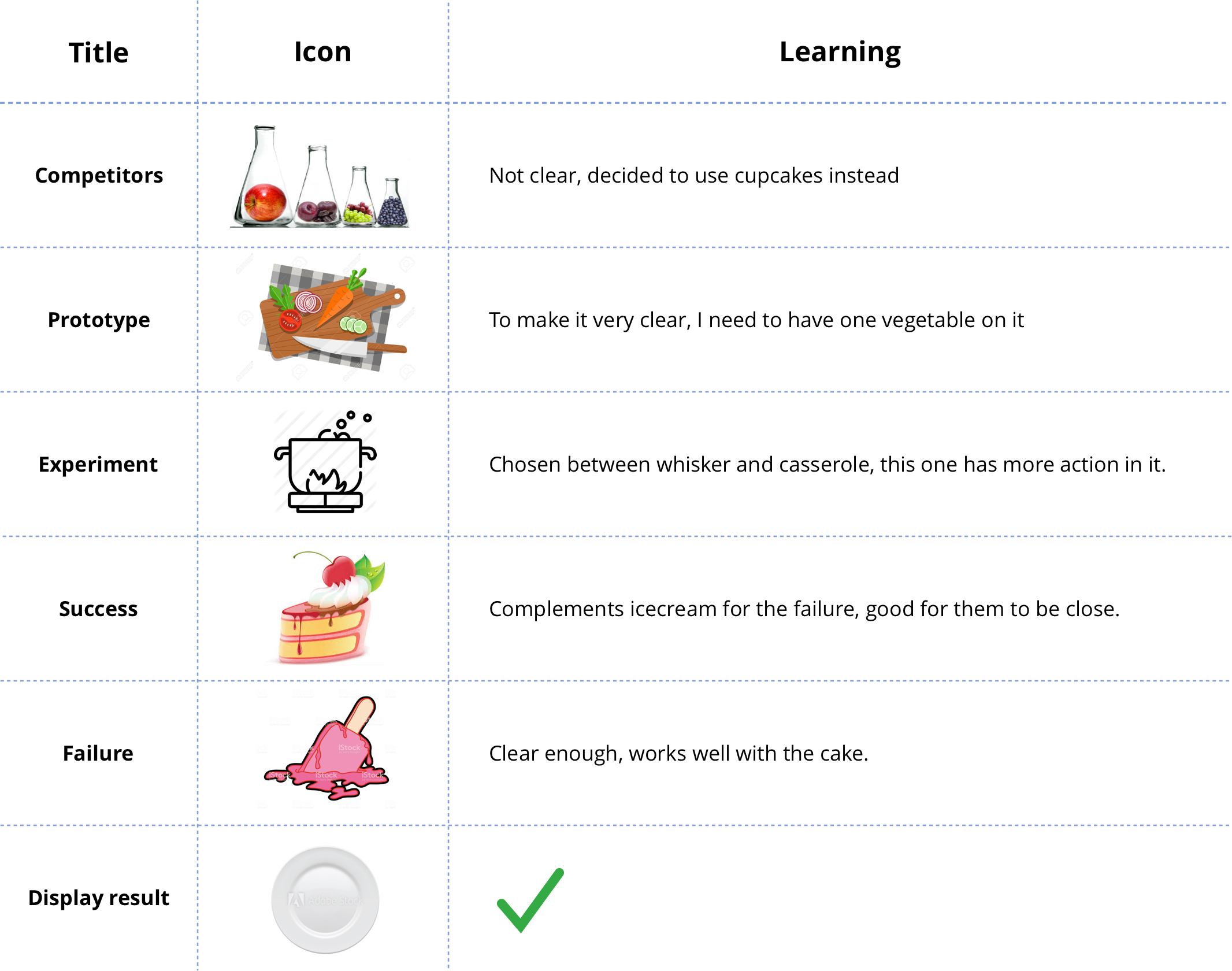
Ideation began with 2 words: success and failure. I then wrote down a list of words I wanted to express and came up with a few ideas for each word.

Conducting an interview

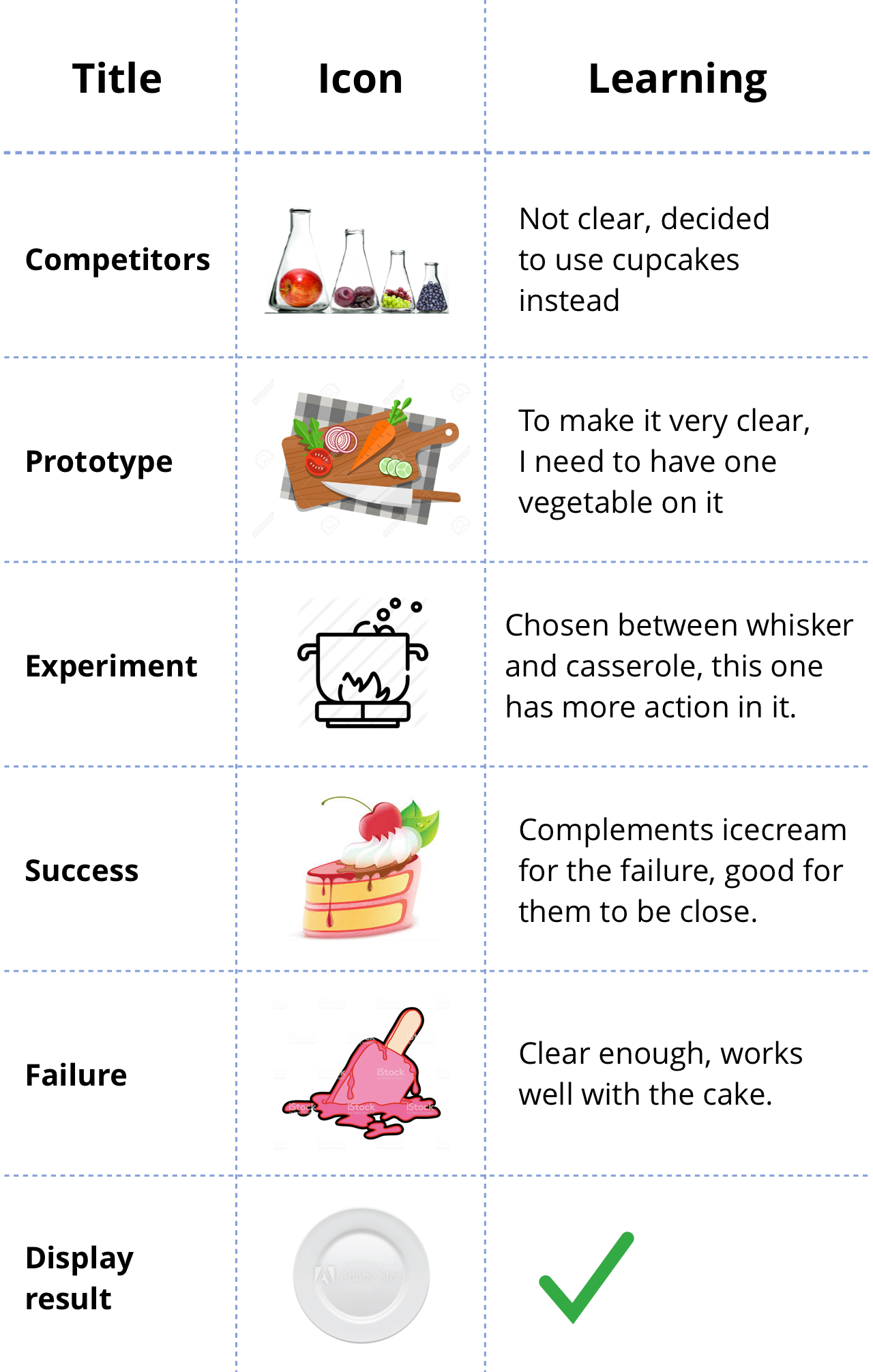
For each “title” I had several candidates. I brought top choice illustrations into a page mock-up and interviewed several people. For each illustration there were alternatives from which I asked people to pick the best and explain their choice.

Summing up candidates

Developing illustrations

Setting the rules

To ensure illustrations had the same style, I wanted them to have the same:

Style sample

Some of the illustrations I studied in more details.

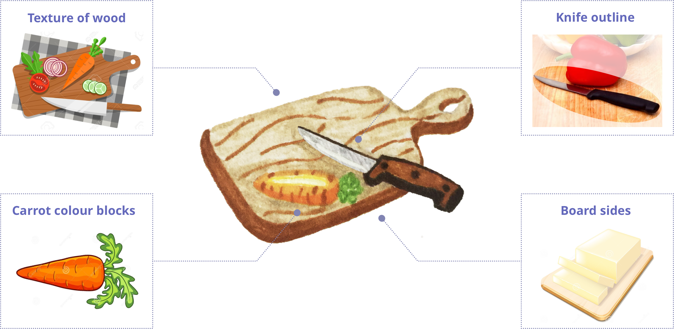
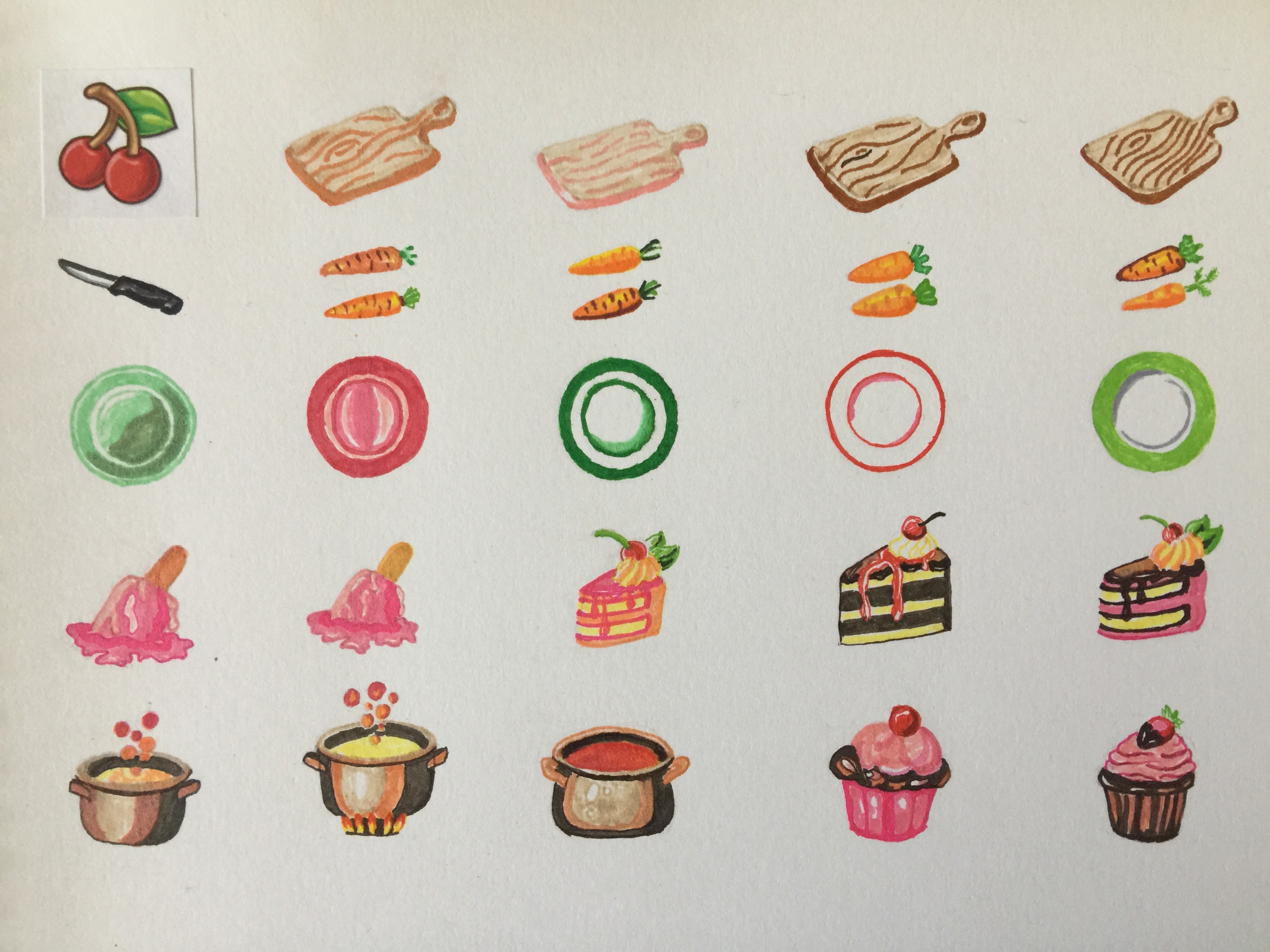
Cutting board

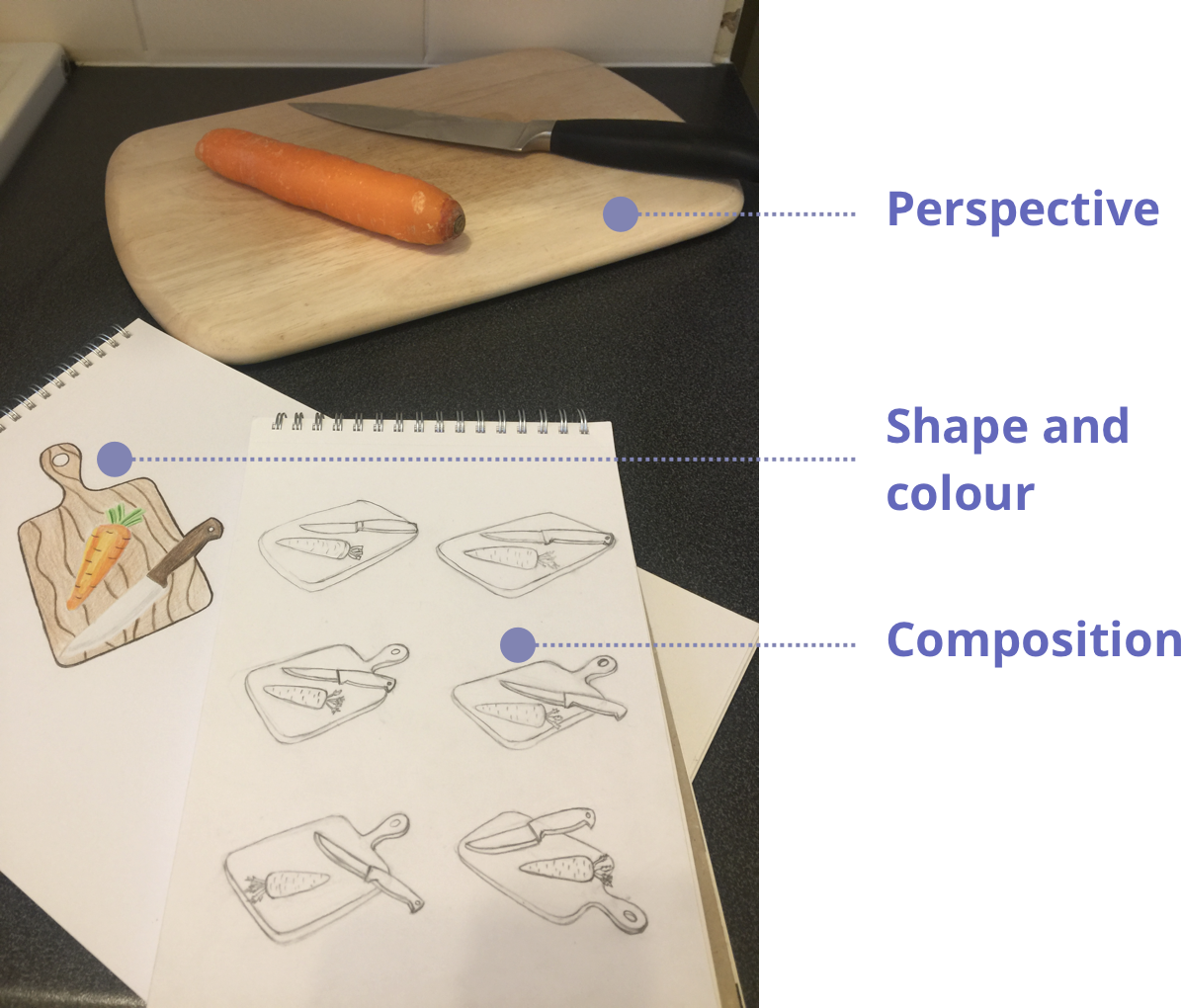
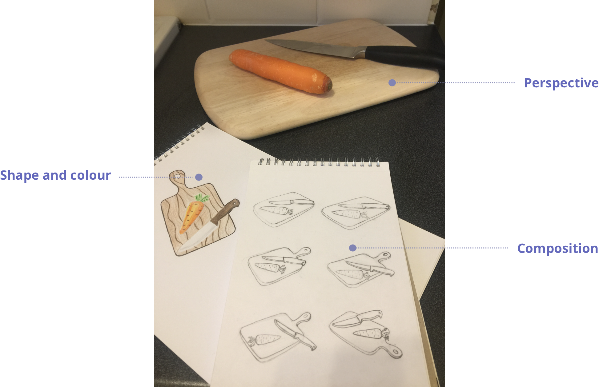
First, I decided on the shape and colour of the elements on the board. I then took several photographs of the items to see how they would look in perspective and what composition would work best for placing those items on the board. This was followed by sketching to determine, how the perspective would work best with the shape of the board.

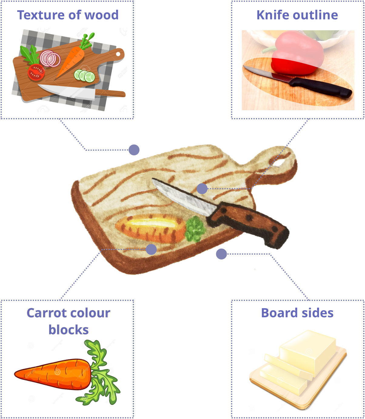
Study

Architecture

Casserole

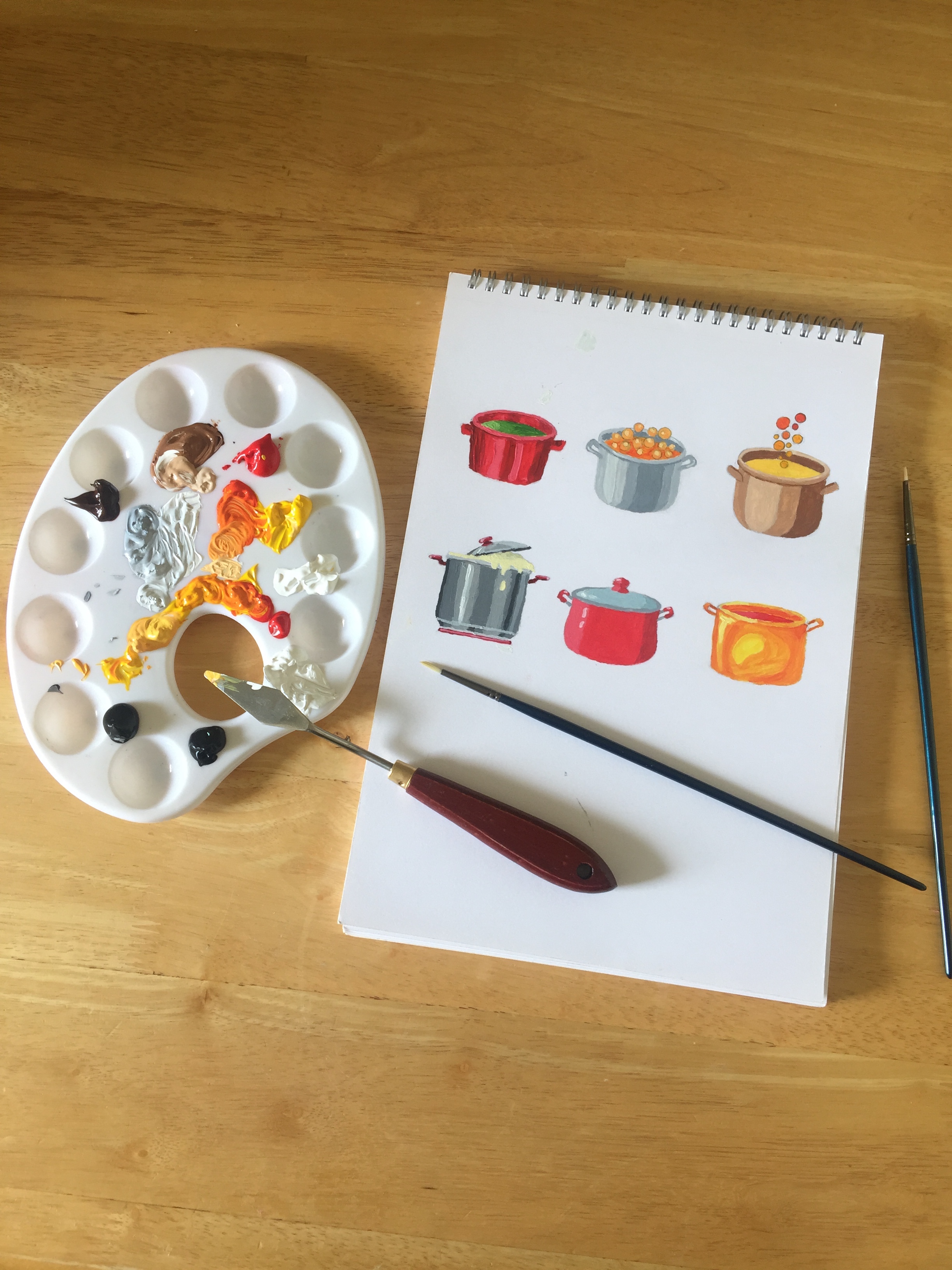
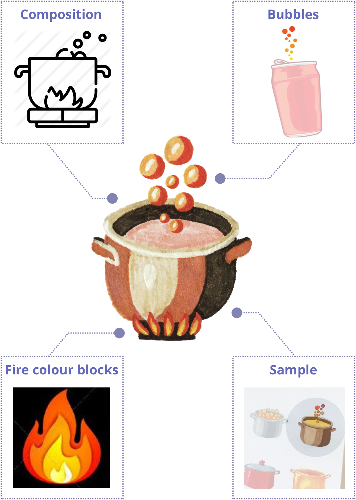
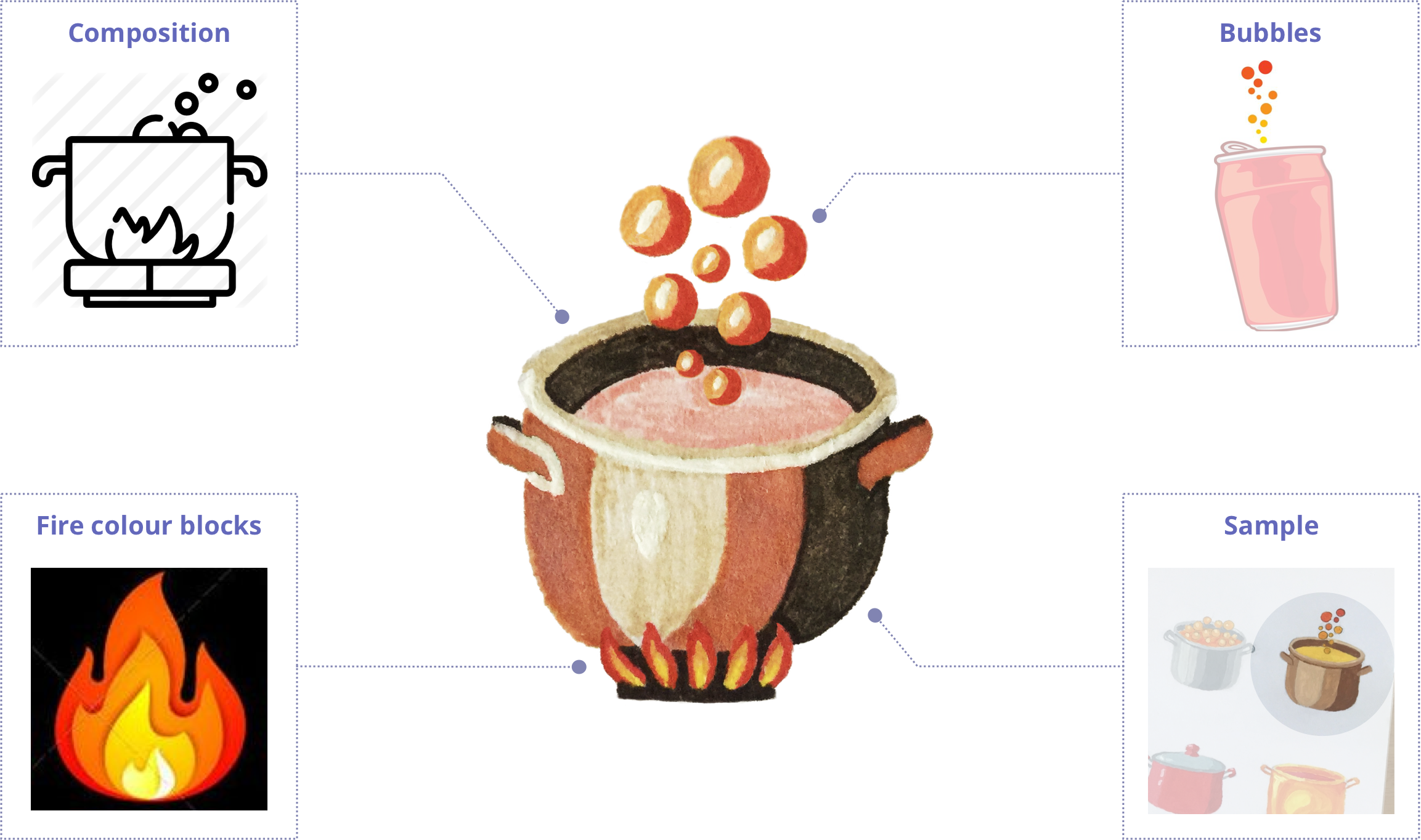
In the interview 3 out 5 people preferred casserole for the “Experiment”. The casserole on fire with bubbles looks entertaining and vibrant, so I took the sample 2D outline icon and converted it into a colourful casserole with perspective. To narrow down the shape and colours I did a small study in acrylics and ended up picking one of the samples.

Study

Architecture

Cupcakes

The cupcakes stand for “Competitors”, for difference. The idea was to come up with 3 different cupcakes.

The challenge

  • my chosen colourscheme
  • shape of the bottom simplified but realistic
  • colour contrast between top and bottom
  • contrast between cream and base
  • wavy creamy top
  • top same width and height as bottom
  • decoration on top to make it taller

Study

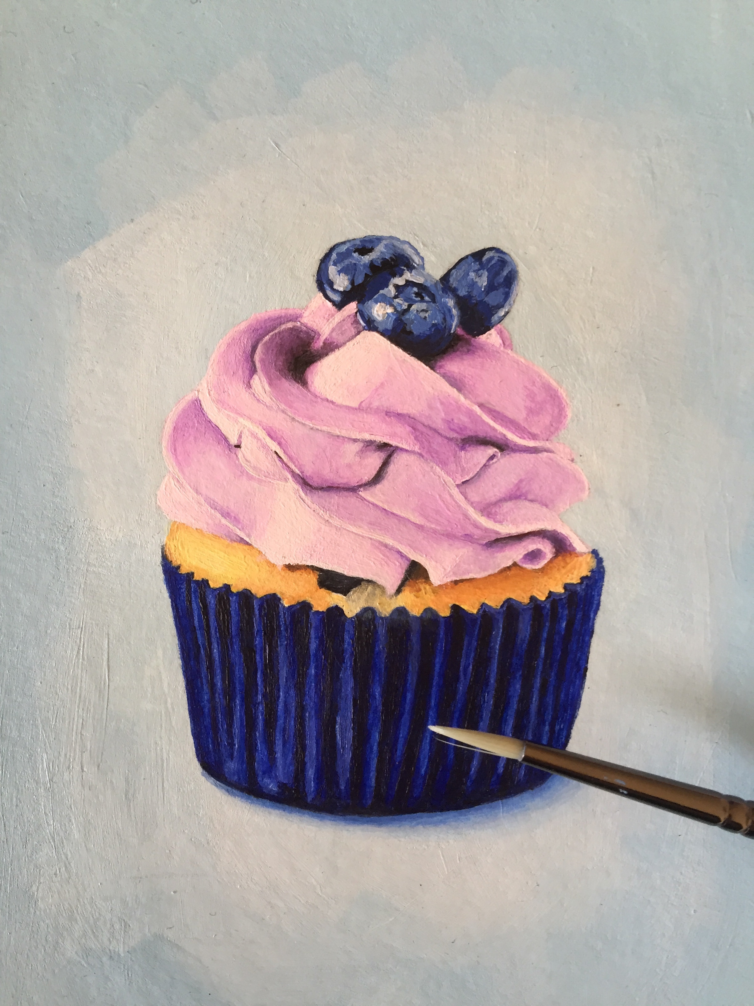
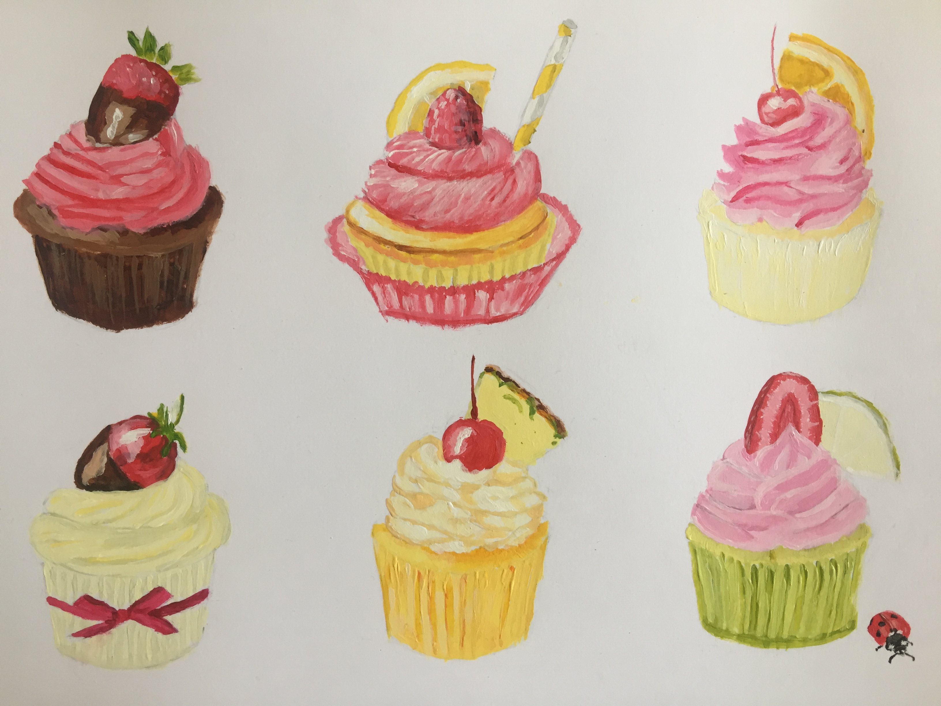
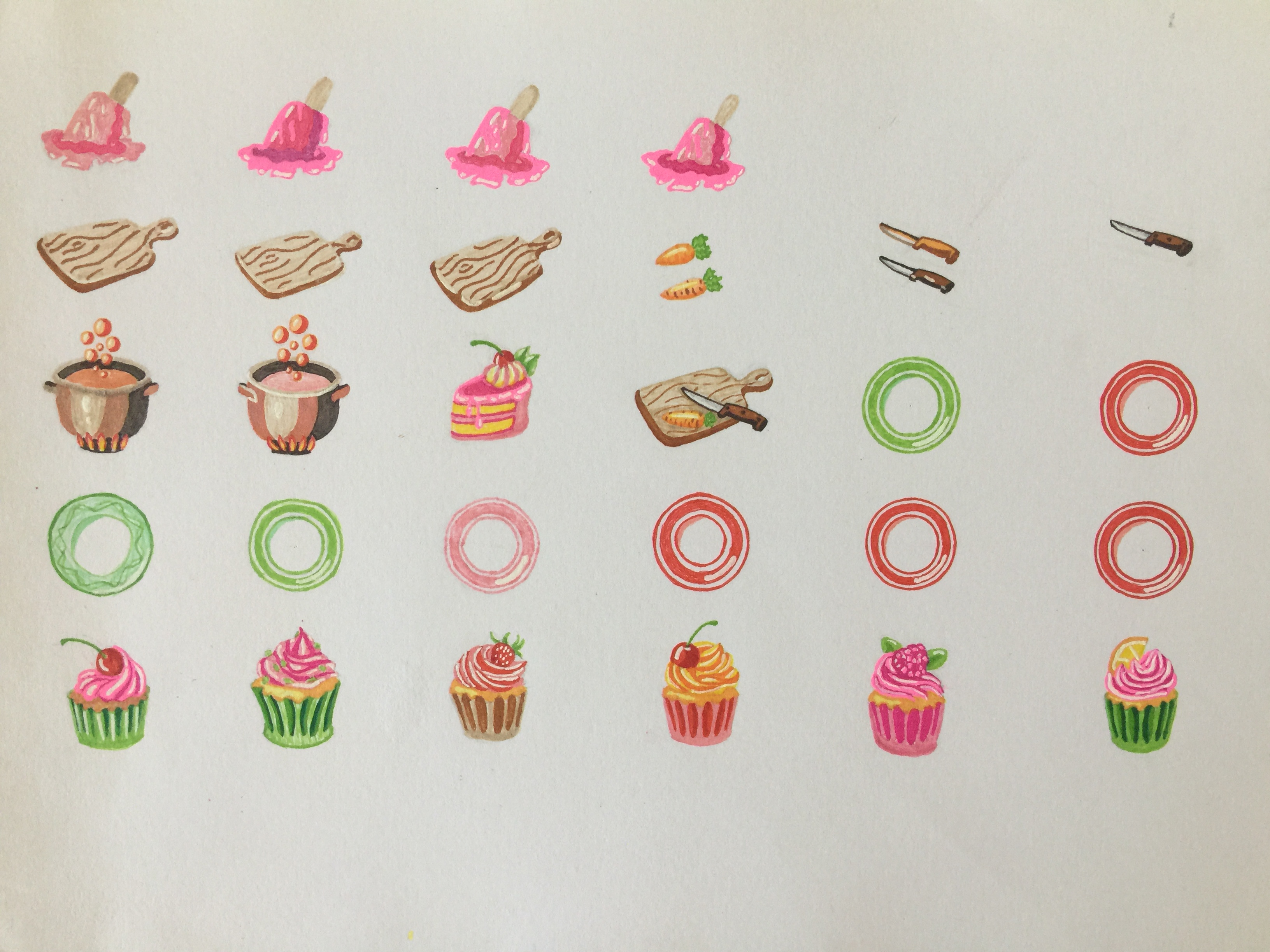
Painting and sketching cupcakes from photos helped me to familiarise myself with their features.

Architecture

The message behind the order of the cupcakes

Drawing and processing

Drawing with pen and paper

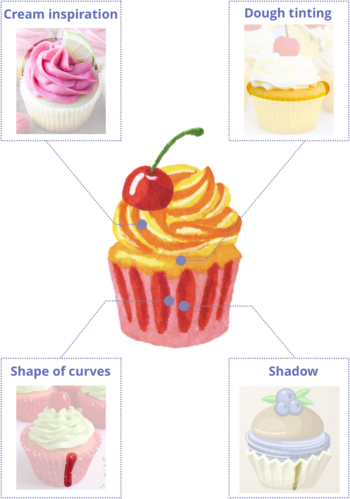
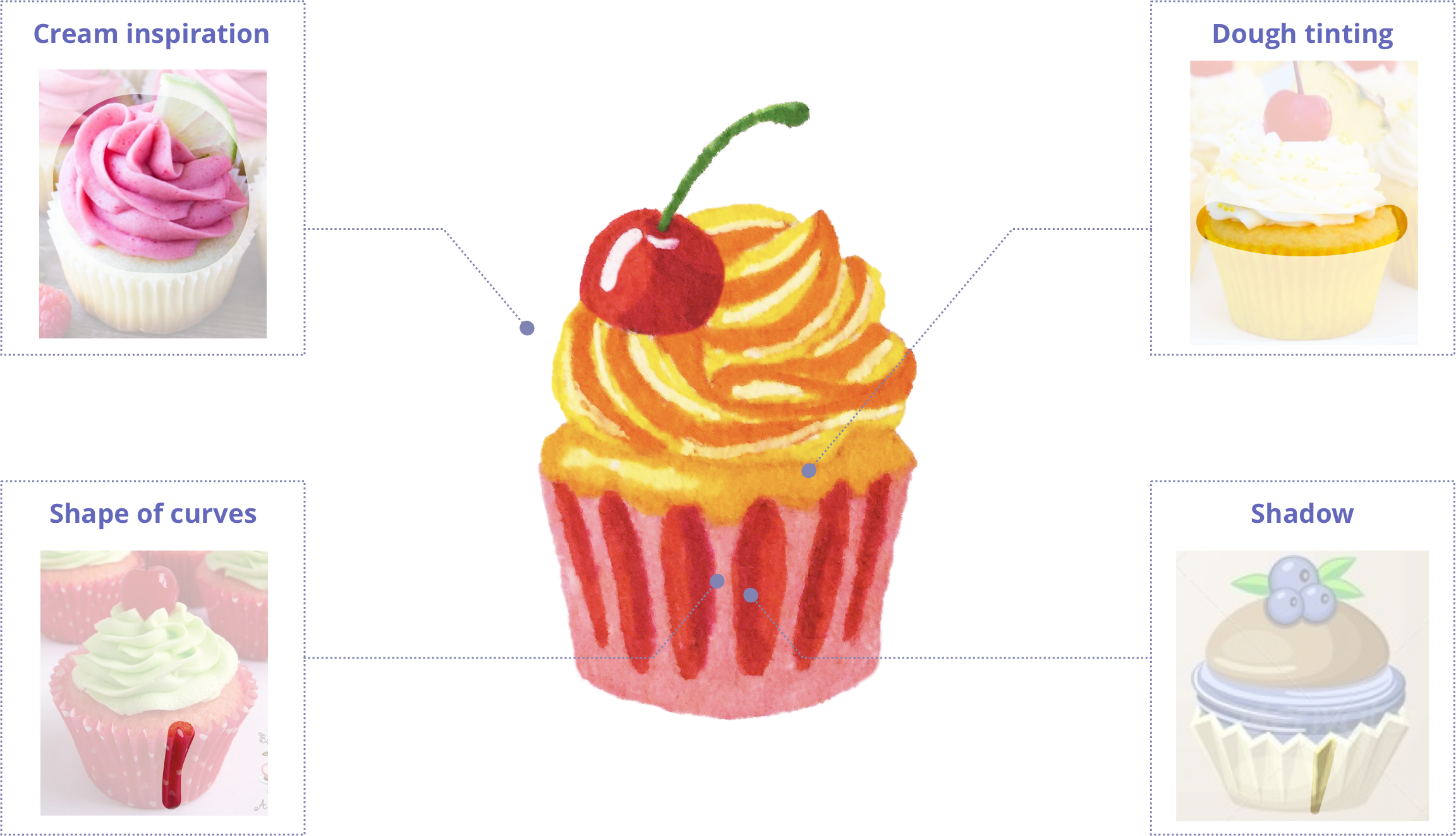
The next step was to elaborate on detail. That's why I went for drawing real-size, on paper, used gelly pens and tombows. Cherries in the top left corner worked as an example.

Refining

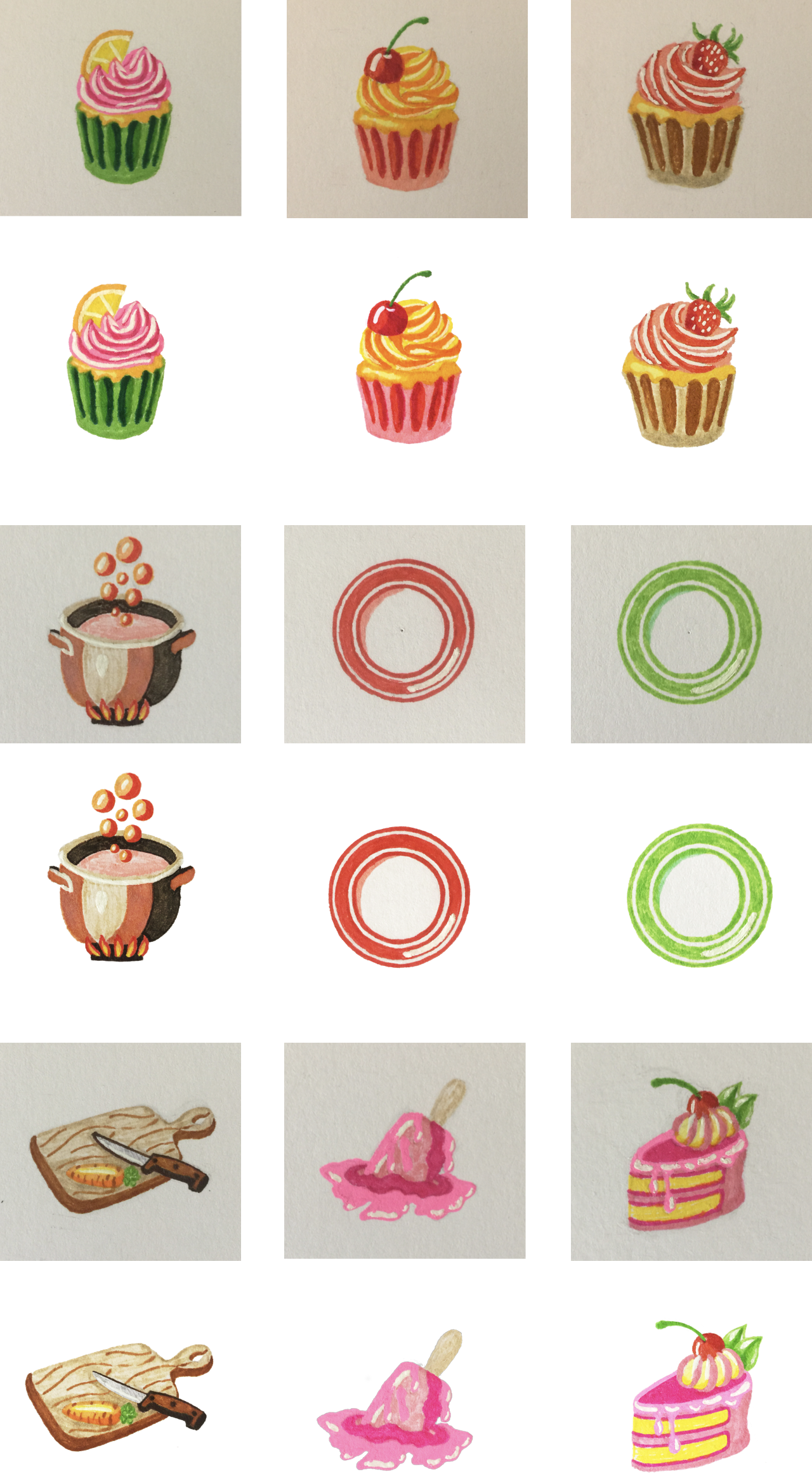
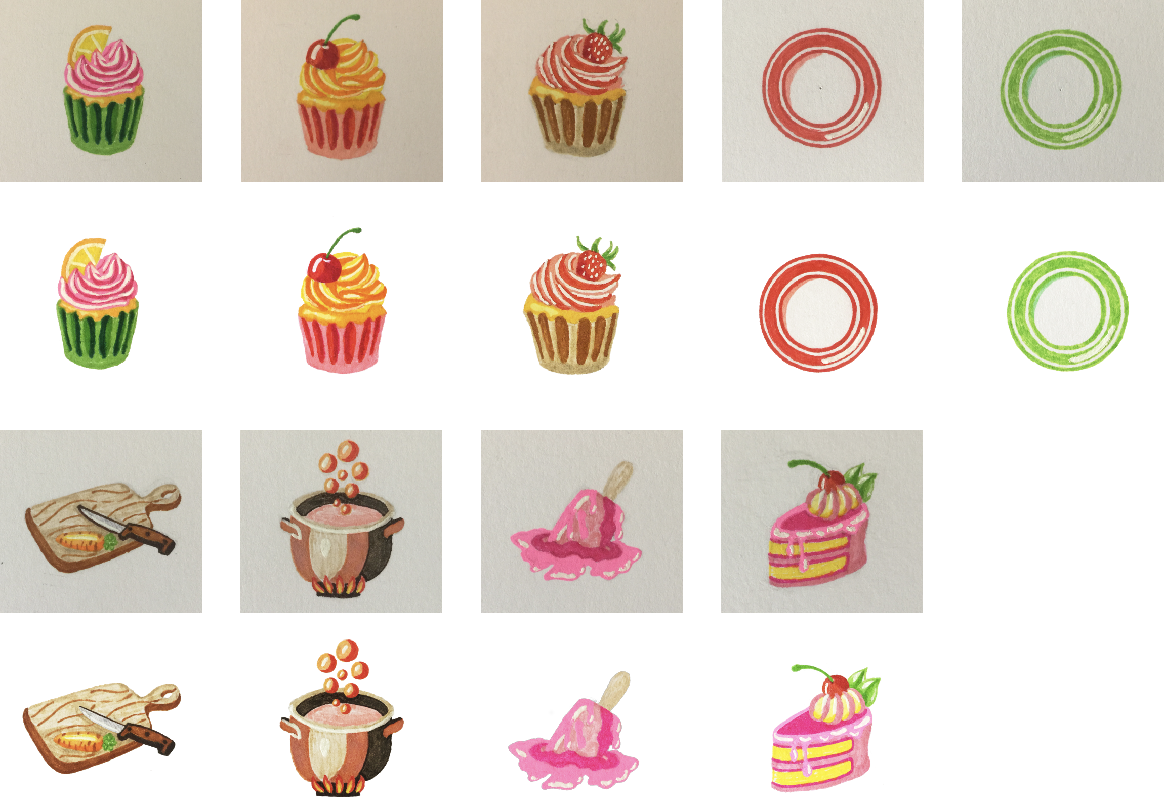
Illustrations drawn on paper have an advantage over those rendered in vector: they have a lively texture, and they looked so nice that I decided to keep them hand drawn. All I added was a bit of processing to clean them up a little and ensure they look like they get same amount of light.

Final set – my pride and joy

Check this page to see illustrations in situ.